

ACE Parking:
Corporate Rebrand
Category
Branding
Deliverables
Logotype
Logo Application
Brand Guideline Development
Overview
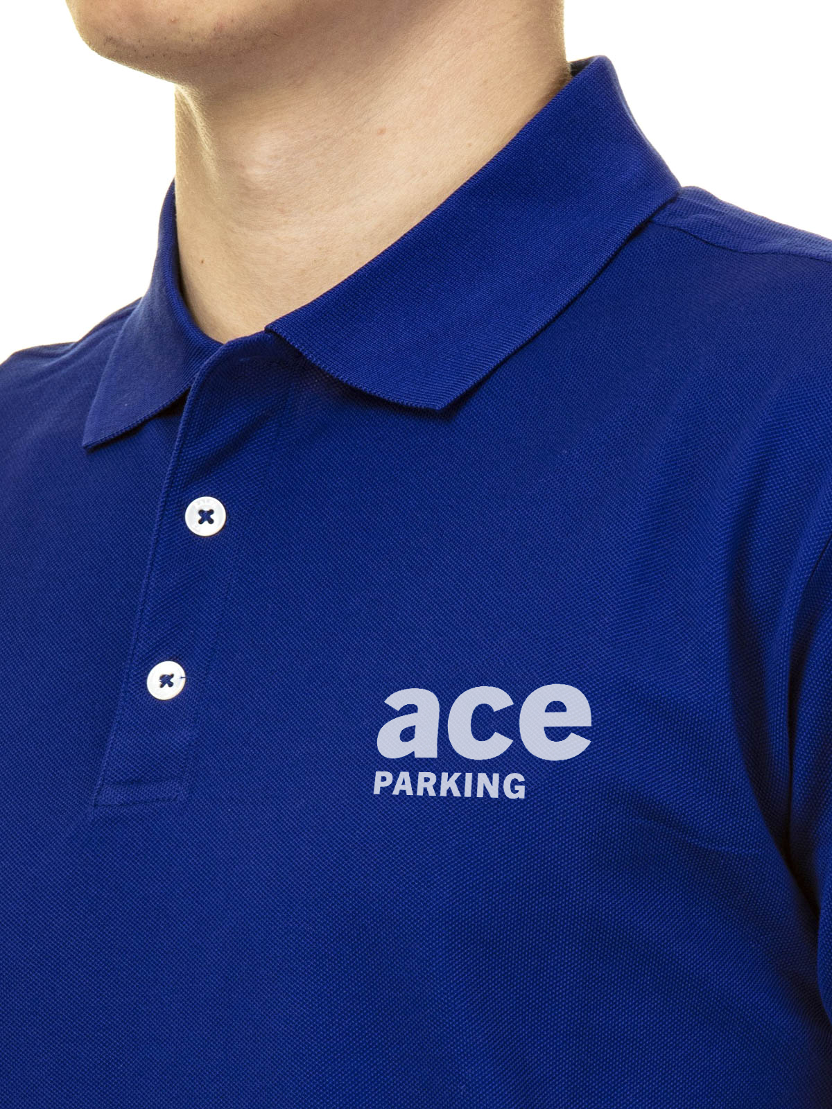
Ace Parking was started in Downtown San Diego and has been a long-time trusted parking services company for over 50 years. Although Ace Parking has been a long-lasting business in the parking services field, its logo and overall branding were beginning to lackluster.
For that reason, a re-brand for this corporate company to showcase its integrity and service to the San Diego area was just what was needed to keep its share of the parking services industry for the years to come.

Designer Statement
For the rebrand of Ace Parking, a brand audit was created to discover what was and wasn’t working for the company over the last 5 decades. After deciding what design aspects of the brand had withstood time, and what visual identity the company could benefit from keeping, an updated brand guideline along with a renovated logo was created.


Brand Guidelines
The new brand guidelines for the company to follow included type, logo, and color treatment guidelines as well as a photo treatment guide to make sure a consistent look and feel could be seen across all digital and print platforms of the company.


Sticking with Values
Brand aspects like the company’s “Broadway Blue” and Sans serif -style typeface were kept in order to maintain the company's recognition in the parking services industry. Keeping “ace” lowercase was also maintained because it was found to represent the company’s friendly and trusting demeanor in a customer case study.


